Monday, 31 October 2016
Friday, 21 October 2016
Illustrator
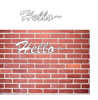
 When you add text with the text tool you can change the colour of the text or create outlines by selecting the fill colour and the stroke colour. Th stroke colour is the colour you want for your text outline. You can also change the thickness of the stroke to make the outline thicker or thinner.
 Also if you select the text and right click and click create outlines the program selects the outlines of the text and creates anchor points for you. With the anchor points you can drag them to change the shape of the text to the way you want it to look like.
 You can create a copy of the text you make by selecting the whole text and holding down alt whilst you drag the text to create another copy of it. You can then add an image to illustrator by placing it onto the program. You can drag the text on top of the image and make the text a compound path by clicking object and compound path . This will create an outline of your text
Wednesday, 19 October 2016
Magazine newsstand task
At the newsagent I visited there were different sections for
different magazines. The music magazines were found above the Music and Hi Fi
section. The rock/metal magazines were mainly placed next to each other in the
middle row. Around these magazines were magazines that were about sound and
mixing. There were a few magazines at the back of the row that did not have
anything to do with music or hi fi. The majority of the magazines in this
section were mainly mixing magazines. The magazines at the front covered the
magazines behind them about half way. One of the most noticeable things on the
front covers were the mastheads. As they were placed at the top of the magazine
it was what you could mainly see. They are also quite big and bold which makes
them stand out. The colours used on these magazines are quite bright, making
them stand out even more especially the text. There are also a few skylines on
the magazine that stand out, like “Free plug-ins” and “Special collector’s
edition”. These things attract the reader’s attention because it makes it look
like the content in the magazine is only limited to the current issue that is
being displayed, making the reader want to buy it.
 The images on the front covers are mainly pictures of
people. These pictures are probably pictures of artists that are featured in
the magazine. By using pictures of artists they can attract the attention of
reader’s that are interested in these artists, which increases their sales as
more people are likely to buy it. The cover lines of these magazine are not visible
as they are covered by other magazines. Only parts of the cover line can be
seen on the front of the magazines. This can intrigue the reader by making them
want to know more about what it says and what is being featured in the
magazine. A lot of the magazine use white text for their masthead to keep it
plain but also because it contrasts with the background making it stand out
more. Furthermore some of the magazines are quite hidden like Q magazine. This
is because magazines like Q magazine have quite a big reputation so the reader’s
usually look for the name of the magazines rather than the content. This is
because they know the magazine is quite popular and that popular magazines
normally have good content.
 Distribution of magazines
Kerrang:
Kerrang offers a subscription service as their target
audience is mainly teenagers. Teenagers tend to want to own have a physical
possession of magazines. Furthermore Kerrang also offers posters and free gifts
in their magazine. Teenagers like to collect free gifts from magazines and take
posters of their favourite bands and stick them up usually. Therefore by
including these things in a magazine their target audience would want a
physical copy of the magazine rather than having an electronic magazine as they
are able to have a physical possession in their hands.
Kerrang does not offer an e-zine version of their magazine.
Instead Kerrang owns a website which includes similar content that is included
in their magazine however the content available on the website is less in depth
than the content in their magazine. This is gives their reader a teaser of the
content included in the magazine to make their audience buy their magazine
more. Considering their target audience Kerrang does not create an electronic
version of their magazine because their target audience mainly wants to own a
physical possession of their magazine instead of an electronic version. Furthermore younger audiences are less likely
to read articles on their bands as there are more interested in the free gifts
and posters included in a magazine therefore it would be better to have a
subscription instead of an electronic version.
The content on Kerrang’s website is slightly different than
the content in their magazine. This is because the website is more up to date
than the magazine. The magazine is only released once a week whereas the
website can be updated whenever there is new content available. The website
includes a page where they talk about the magazine and what content is featured
in the newest magazine they have released to give the audience a few reasons as
to why they should buy their magazine.
Kerrang uses Facebook and Twitter to tweet about new content
and the most recently released magazine. They also use social media to interact
with their readers. This makes the reader feel more connected to the magazine
and that the editors care about their readers. They also gain feedback on their
magazines through the use of social media so they know what readers want to see
in their magazines, which helps them generate more content for their next
magazine. By using social media they are spreading awareness to their fans by
connecting to them more and making their content available on different
platforms which their target audience uses.
Q magazine:
Q magazine offers
a subscription service. Their target audience is mainly for older people like
people in their 30s. Older people tend to want to have a physical version of
the magazine as they can read it and pick it up whenever they have time.
Furthermore people that are into the genre of Q magazine’s music are more
likely to buy a physical copy.
Q magazine does
not offer an e-zine version of their magazine mainly because the articles
included in their magazine are very wordy. Rather than reading all of this on
an online article it would be much better to have a physical copy of the
magazine. The articles are quite long so the target audience may want to be
able to pick up the magazine whenever they want so they can continue reading
it. For example when they are having a coffee break or maybe doing some free
time.
The content on Q magazine’s website includes a brief summary
about what the most recent magazine includes and what it is about. Also the
website does include some voting polls for music awards. The website also
includes more competitions whereas the magazine does not include too many
competitions. This may be because their target audience is older and by
including competition it makes the magazine see slightly childish. There is a
track of the day page on their website to provide content for their audience every
day. There is quite a large difference from the type of content included on
their website compared to the magazine. This shows that their website is aimed
at a different audience that is younger.
Q magazine uses a variety of different social media
platforms to reach out to more of their readers. Using different platforms they
provide different types of content on each platform to meet their reader’s standards.
Furthermore by having different types of content they can see what their reader’s
like and what they don’t like, which allows them to improve and provide more on
the content that they create. For example on YouTube they provide videos of
interviews with different artists, whereas on Instagram they post behind the
scenes pictures of photoshoots or events. With so much available content on
different platforms not only do they gain a wider range of reader’s but they
also make their content easily accessible to their audience so that more people
can view it.
Friday, 14 October 2016
Monday, 10 October 2016
Tuesday, 4 October 2016
Monday, 3 October 2016
photoshop test cover
On photoshop I designed a test cover and played around with the tools on photoshop. I learnt how to add text and change the colour and angle of the text. Furthermore I learnt how to upload pictures onto photoshop and transform them. I used shapes to add a skyline and a puff on the cover of my magazine. I used a picture of Halsey as the background of the magazine. I learnt how to use the select tool and how to rasterize layers do that I could edit text and change the format of it. I was able to change the font of the text and the size of the text. Furthermore I learnt how to add in guidelines to prevent any content from getting cut off.
Subscribe to:
Comments (Atom)


